Knime UI fonts rendering poorly
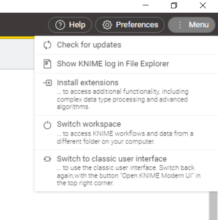
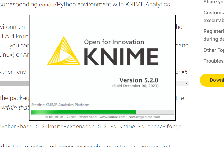
Unfortunately, I find the rendering of fonts in Knime to be poor. The gray text, especially italics, is difficult to read.
Here is the splash screen. Compare it to the text in the Chrome webpage in the background, which is much sharper.
I am on Windows with 2560x1440 resolution, text size 125%.
Thanks.