Horrid dialogue design in the new UI
Hello,
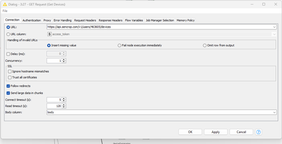
That was quite a disappointment this morning. I installed the latest update just last week. I had a feeling this would happen. This is what the dialog looked like before the update: neatly structured and concise.
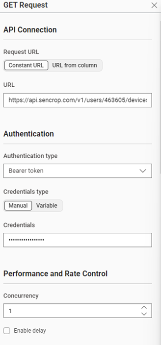
And you get this kind of wallpaper in a new UI design. Unbelievable.
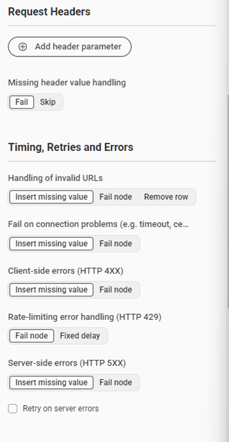
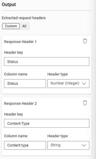
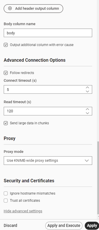
Then I found this.
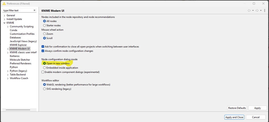
Which doesn’t make the whole thing any prettier.
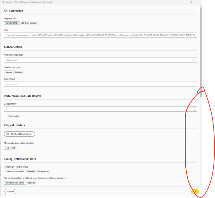
Wasted space leads to unnecessary scrolling in dialogues.
This is also very tiring.
Best regards,
Patrik